How to Access Google Sheets Using API?

Google Sheets - with its super clean interface and effortless visualization - is every knowledge worker’s sweetheart these days. From simple data entry to project management, the mighty Google Sheets unleashes all the possibilities.
But for developers, working directly with a spreadsheet can be annoying. If you are hinting about CSV files, we can conclude they are not nifty for our workflows.
This marks the dawning of Sheet Best!
After spending tons of hours on new projects and tools, we figured there had to be a simple way of using spreadsheets as a database. A nice layer of REST API on the spreadsheet would be a cherry on top.
From today’s tutorial, let’s find out how to build a cryptocurrency price tracker straight from Google Sheets.
We’ll set up the spreadsheet with some data, add it to the Sheet Best, and show how the spreadsheet transforms into REST APIs in less than 60 seconds.
After that, we’ll show you how to get line of best fit on Google Sheets so it’s easier to visualize trends, gain valuable insights, and share your findings with others.
Let’s get started!
Step 1: Fire up the Google Sheet
Open a new blank Google Sheet and input your data.
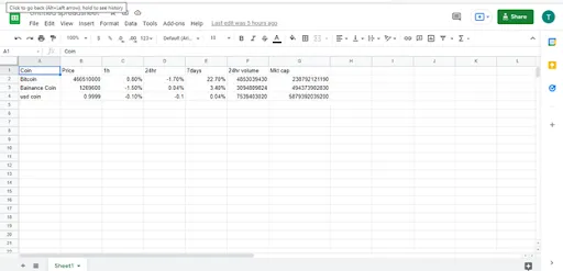
Here we’ve put together a data set exhibiting the cryptocurrency prices.
Step 2: Generate a shareable link
From the Share option at the top, create a shareable link for the file. Change the privacy to “Anyone with the link on the internet can View.”
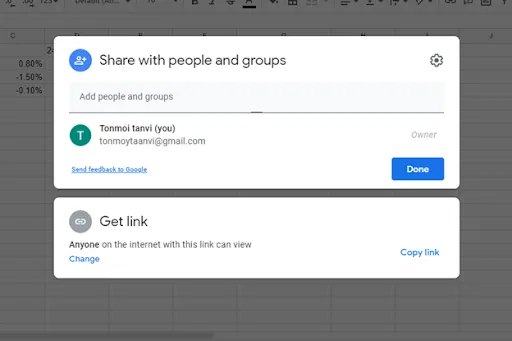
Copy the link to your clipboard.
Step 3: Drop to Sheet Best
Next up, type Sheet Best on your browser and flick on the +Connection button.
Step 4: Paste the spreadsheet URL
On the Connection URL, paste the spreadsheet URL.
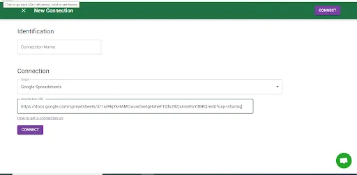
Make sure the origin is marked as Google Spreadsheet.
Tap on Connect, and voila. You have created a brand new REST API for your data set.
Step 5: Copy the API or Connection URL
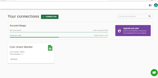
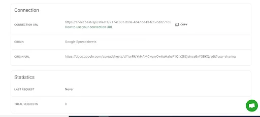
Copy the API or Connection URL to your clipboard.
Step 6: Dive on Postman
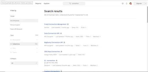
You can quickly verify the feasibility of the API from your browser.
What we do in Sheet Best is paste the APIs into Postman.
If you’ve never heard of Postman, it’s a straightforward way to send requests to APIs.
Step 7: Wrapping up with JSON data
Move to the Explore section from Postman.
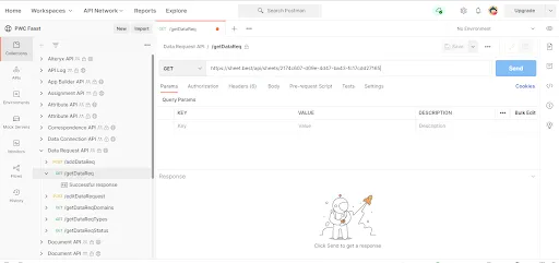
Paste the API URL, and hit Send.
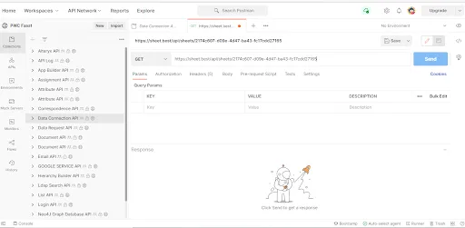
And boom! The spreadsheet is all transformed to JSON data.
Protip: Visualize data with line of best fit on Google Sheets
Now that you have your API up and running, let’s explore some fun visualization techniques to bring your data to life.
One of the most underrated features of the Google Sheets best fit line.
This is basically a fancy way of saying “let’s draw a line that kinda sorta fits the trend in our data points”. But don’t be fooled by the simplicity of this visualization - it can help you identify correlations and make smarter decisions based on your data.
For example, imagine you’ve been tracking the price of Bitcoin over the past year. By adding a line of best fit in Google Sheets, you may be able to identify if the price is on an upward or downward trend. You can use this to help you decide if it’s a good time to buy, sell, or hold your BTC.
Here’s how to make a line of best fit in Google Sheets.
Step 1: Create a scatter chart
Before we actually get a best fit line in Google Sheets, we’ll need create a scatter chart, which looks something like this:
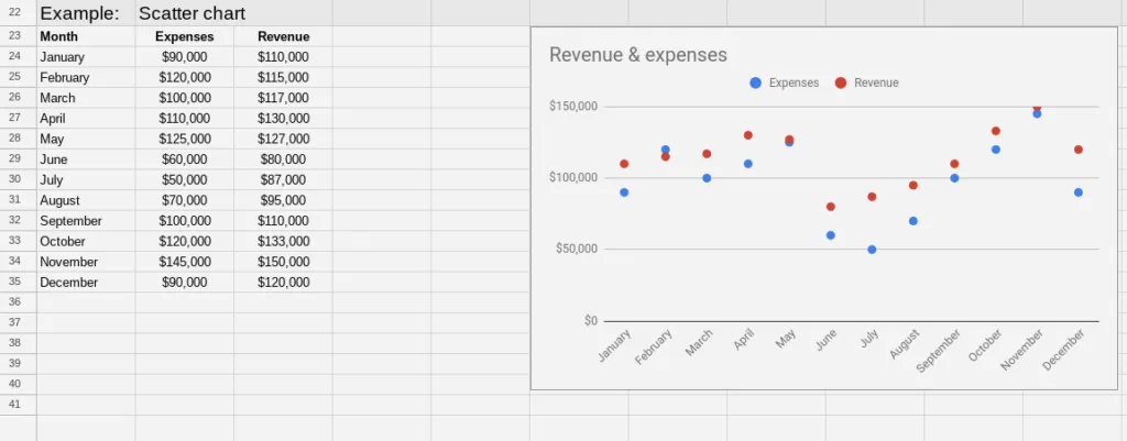
First, select the data range you want to include in your chart, and don’t forget to give your columns some sweet headers.
Next, hit up the Insert menu in the top navigation bar and click on “Charts”. A chart will automatically appear on your sheet, and then you’ll see the “Chart Editor” sidebar pop up on the right side of your screen.
Now, Google Sheets is pretty smart and will try to recommend a chart type based on your data. But it’s a scatter chart you’re after, no worries!
So go to the “Setup” tab in the Chart Editor and find the drop-down menu below “Chart Type”. Choose “Scatter Chart” from the options, and voila!
Easy peasy, right?
Step 2: Adding Google Sheets line of best fit
Now that we have our scatter chart up and running, it’s time to add a line of best fit to give us a clearer picture of the trend. Luckily, Google Sheets makes this super easy!
First, select the Customize tab from the Chart Editor sidebar, which should still be open on the right side of your window. If not, double click the chart and it will show.
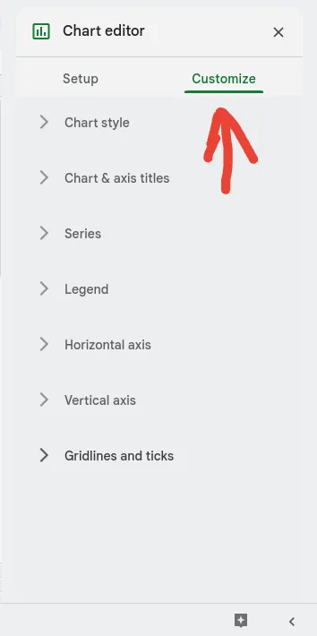
Next, look for the Series drop-down menu, which should show you all the data series you have in your chart.
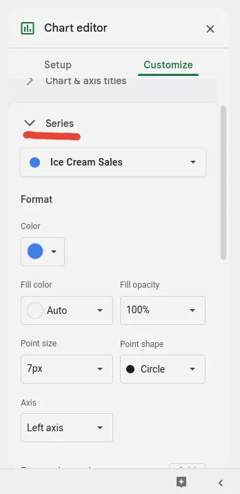
Once you’ve located it, scroll all the way down to the bottom of the drop-down menu. You should see three checkboxes there, waiting for you to tick them off.
The one we want is the Trend Line checkbox, which will add the line of best fit to our chart.
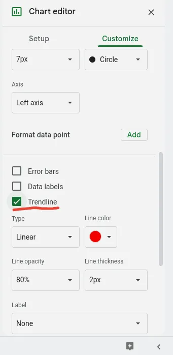
And that’s it! You should now have something that looks like this:
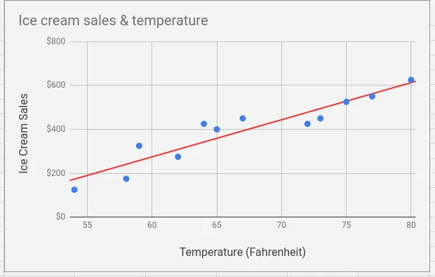
With just a few clicks, we now have a chart that not only displays our data but also shows us the overall trend and direction. Pretty cool, right?
Customizing your Google Sheets best fit trendline
Google Sheets offers you a plethora of options to customize your trendlines.
You can take your data analysis to the next level by choosing from different types of trendlines, including exponential, linear, logarithmic, power series, moving average, or polynomial trendlines.
And that’s not all! You can also customize the color, thickness, and opacity of your trendlines so that they fit your needs perfectly.
So, whether you want your trendline to be neon green and three pixels thick, or a subtle shade of blue and half-transparent, you can make it happen. The best part is that you don’t need to be a design wizard or coding genius to do it!
Expect no less than Google Sheets to make adding trend and best fit lines easy as possible.
Benefits of a best fit line in Google Sheets
Now that you know how to do line of best fit on Google Sheets, you might wonder, “Why the heck should this matter?”
It’s actually a useful tool for anyone who wants to analyze trends and make data-driven decisions. Here are some benefits of Google Sheets line of best fit:
- Identify trends: A best fit line helps you see the overall trend in your data. Whether you’re tracking cryptocurrency prices or sales figures, the best fit line will give you a quick and easy way to identify whether the data is trending up, down, or staying relatively stable.
- Make predictions: Using a best fit line, Google Sheets helps you make predictions about where the data will go in the future. Of course, these predictions should be taken with a grain of salt, but it can be useful for making informed decisions based on the data you have.
- Visualize relationships: It makes it easier to visualize the relationship between two variables. For example, if you’re tracking the price of a particular cryptocurrency against the total volume of transactions, it will help you see how these two variables are related to each other.
- Communicate insights: Finally, knowing how to get line of best fit on Google Sheets can also help you communicate insights to others. Whether you’re presenting to your boss or sharing data with a team, a best fit line can make the information more digestible to other people.
So don’t be intimidated by the idea of adding a best fit line to your Google Sheets charts. Just a few mouse clicks, and you can gain valuable insights using data that you have on hand.
Conclusion
Now that our simple API is ready to hit the station, we can create, update, delete (CRUD) on our first-hand backend. Additionally, we can develop a simple UI in React or Vue to show these prices to the concerned users.
And don’t forget the power of the line of best fit in Google Sheets - it can help you better understand the trends and patterns in your data.
If you want to notch things up a bit, pull out other crypto APIs and combine them in the existing spreadsheet. This should put a good show for the users.
The knack for using Google sheet as a REST API is undefinable, but we did have some fun tweaking with crypto prices.
Hopefully, the fun little venture unleashes some of your unique ideas. If you’ve anything fiery for the blog, just shoot!